
1. SVG 태그란?
- SVG태그는 Scalable Vector Graphics의 약자로 벡터 기반 그래픽을 XML 형식으로 정의하는 것을 의미합니다.
- SVG태그는 SVG그래픽을 담기 위한 요소입니다.
- SVG태그 내부에 담을 수 있는 것은 원, 사각형, 다각형, 라인, path 등이 있습니다.
- SVG태그는 파일의 모든 요소와 모든 속성에 애니메이션을 적용할 수 있습니다.
## SVG태그
<svg width="가로영역" height="세로영역">
	SVG그래픽
    ...
</svg>
- svg는 컨테이너로 묶음을 의미합니다. 내부에 그래픽을 담기 위한 그릇과 같은 태그입니다.
2. SVG Filters
- SVG 필터는 SVG 그래픽에 특수 효과를 추가하는 데 사용됩니다.
## 태그
<fe...>- 뒤에 기능들이 영문으로 붙음
- <feBlend> : 이미지 결합용 필터
- <feColorMatrix> : 색상 변환을 위한 필터
- <feOffset> : 그림자를위한 필터
- <feDistantLight>, <fePointLight>, <feSpotLight> : 조명용 필터
- 많은 필터 태그가 존재합니다.
3. SVG Blur Effects
- 벡터 요소를 번지게 처리하는 효과입니다.
- 모든 SVG필터는 <defs>태그 내에 존재합니다.
- defs는 definition of special elements를 줄임말입니다.
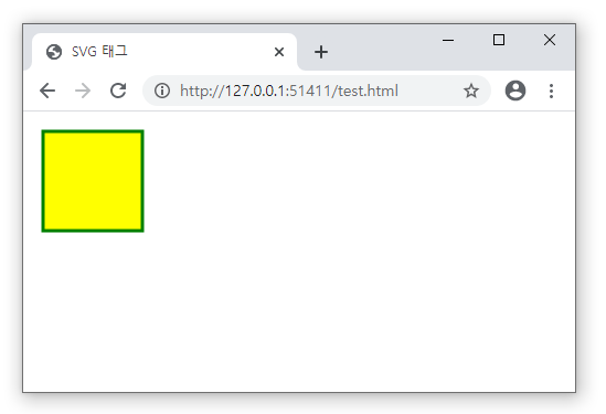
## 블러효과를 주기 전 벡터 코드
<!DOCTYPE html>
<html lang="ko">
    <head>
        <meta charset="UTF-8">
        <title>SVG 태그</title>
    </head>
    <body>
        <svg width="150" height="150">
            <rect x="10" y="10" width="90" height="90" stroke="green" stroke-width="3" fill="yellow" />
        </svg>
    </body>
</html>
## 블러효과를 주기 전 결과
## 블러효과를 준 벡터 코드
<!DOCTYPE html>
<html lang="ko">
    <head>
        <meta charset="UTF-8">
        <title>SVG 태그</title>
    </head>
    <body>
        <svg width="150" height="150">
            <defs>
                <filter id="f1" x="0" y="0">
                    <feGaussianBlur in="SourceGraphic" stdDeviation="15" />
                </filter>
            </defs>
            <rect x="10" y="10" width="90" height="90" stroke="green" stroke-width="3" fill="yellow" filter="url(#f1)" />
        </svg>
    </body>
</html>
- <defs>태그 안에 <filter>태그를 처리했습니다.
- <filter>태그의 아이디를 추후에 벡터태그들에 filter효과의 이름으로 줄수 있습니다.
- <filter>태그의 아이디값을 f1으로 설정했습니다.
- 블러효과는 <feGaussianBlur> 요소로 정의됩니다.
- in="SourceGraphic"부분은 전체 요소에 대해 효과가 생성됨을 정의합니다.
- stdDeviation 속성은 흐림 정도를 정의합니다. 수치가 높을 수록 많이 번집니다.
- <rect>태그에 filter속성으로 <filter>태그의 아이디값을 정의해주면 효과가 들어갑니다.
## 블러효과를 준 결과

4. SVG Drop Shadows
- Drops Shadow는 벡터 요소에 그림자를 주는 효과입니다.
- 모든 SVG필터는 <defs>태그 내에 존재합니다.
## 그림자효과를 주기 전 벡터 코드
<!DOCTYPE html>
<html lang="ko">
    <head>
        <meta charset="UTF-8">
        <title>SVG 태그</title>
    </head>
    <body>
        <svg width="150" height="150">
            <rect x="10" y="10" width="90" height="90" stroke="green" stroke-width="3" fill="yellow" />
        </svg>
    </body>
</html>
## 그림자효과를 주기 전 결과

## <feOffset>으로 그림자 처리한 코드
<!DOCTYPE html>
<html lang="ko">
    <head>
        <meta charset="UTF-8">
        <title>SVG 태그</title>
    </head>
    <body>
        <svg width="150" height="150">
            <defs>
                <filter id="f1" x="0" y="0" width="200%" height="200%">
                    <feOffset result="offOut" in="SourceGraphic" dx="20" dy="20" />
                    <feBlend in="SourceGraphic" in2="offOut" mode="normal" />
                </filter>
            </defs>
            <rect x="10" y="10" width="90" height="90" stroke="green" stroke-width="3" fill="yellow" filter="url(#f1)" />
        </svg>
    </body>
</html>
- <feOffset> 요소는 그림자 효과를 만드는 데 사용됩니다.
- in="SourceGraphic"은 SVG 그래픽 (이미지 또는 요소)을 가져와서 그림자처리를 한다는 것입니다.
- dx와 dy속성은 요소에서 이동하는 것입니다.
- <feBlend>는 원본 그래픽을 가져와 오프셋 이미지 위에 원본을 혼합합니다.
## <feOffset>으로 그림자 처리한 결과

## <feGaussianBlur>으로 그림자 번짐처리한 코드
<!DOCTYPE html>
<html lang="ko">
    <head>
        <meta charset="UTF-8">
        <title>SVG 태그</title>
    </head>
    <body>
        <svg width="150" height="150">
            <defs>
                <filter id="f1" x="0" y="0" width="200%" height="200%">
                    <feOffset result="offOut" in="SourceGraphic" dx="20" dy="20" />
                    <feGaussianBlur result="blurOut" in="offOut" stdDeviation="10" />
                    <feBlend in="SourceGraphic" in2="blurOut" mode="normal" />
                </filter>
            </defs>
            <rect x="10" y="10" width="90" height="90" stroke="green" stroke-width="3" fill="yellow" filter="url(#f1)" />
        </svg>
    </body>
</html>
- <feGaussianBlur>태그를 추가하여 <feOffset>과 연결을 위해 in속성을 사용합니다.
- <feGaussianBlur>태그를 추가하여 <feBlend>와 연결을 위해 result속성을 사용합니다.
- <feBlend>의 in2값을 <feGaussianBlur>태그의 result값으로 변경합니다.
- <feGaussianBlur> 요소의 stdDeviation 속성은 흐림 정도를 정의합니다.
## <feGaussianBlur>으로 그림자 번짐처리한 결과

## 그림자를 검은색으로 변경한 코드
<!DOCTYPE html>
<html lang="ko">
    <head>
        <meta charset="UTF-8">
        <title>SVG 태그</title>
    </head>
    <body>
        <svg width="150" height="150">
            <defs>
                <filter id="f1" x="0" y="0" width="200%" height="200%">
                    <feOffset result="offOut" in="SourceAlpha" dx="20" dy="20" />
                    <feGaussianBlur result="blurOut" in="offOut" stdDeviation="10" />
                    <feBlend in="SourceGraphic" in2="blurOut" mode="normal" />
                </filter>
            </defs>
            <rect x="10" y="10" width="90" height="90" stroke="green" stroke-width="3" fill="yellow" filter="url(#f1)" />
        </svg>
    </body>
</html>
- <feOffset> 요소의 in 속성이 전체 RGBA 픽셀 대신 흐림에 알파 채널을 사용하는 "SourceAlpha"로 변경됩니다.
## 그림자를 검은색으로 변경한 결과

## 그림자를 다른 색으로 변경한 코드
<!DOCTYPE html>
<html lang="ko">
    <head>
        <meta charset="UTF-8">
        <title>SVG 태그</title>
    </head>
    <body>
        <svg width="150" height="150">
            <defs>
                <filter id="f1" x="0" y="0" width="200%" height="200%">
                    <feOffset result="offOut" in="SourceGraphic" dx="20" dy="20" />
                    <feColorMatrix result="matrixOut" in="offOut" type="matrix" values="0.2 0 0 0 0 0 0.2 0 0 0 0 0 0.2 0 0 0 0 0 1 0" />
                    <feGaussianBlur result="blurOut" in="matrixOut" stdDeviation="10" />
                    <feBlend in="SourceGraphic" in2="blurOut" mode="normal" />
                </filter>
            </defs>
            <rect x="10" y="10" width="90" height="90" stroke="green" stroke-width="3" fill="yellow" filter="url(#f1)" />
        </svg>
    </body>
</html>
- <feColorMatrix> 필터는 오프셋 이미지의 색상을 검은 색에 가깝게 변환하는 데 사용됩니다. 행렬에서 '0.2'의 세 가지 값은 모두 빨강, 녹색 및 파랑 채널로 곱해집니다. 값을 줄이면 색상이 검은 색에 가까워집니다 (검정은 0).
- <feOffset>의 in은 다시 SourceGraphic으로 변경합니다.
- <feGaussianBlur>의 in은 <feColorMatrix>의 result값과 같게 처리합니다.
## 그림자를 다른 색으로 변경한 결과

5. SVG Linear Gradient
- 그라디언트는 한 색상에서 다른 색상으로 부드럽게 전환되는 것입니다.
- 두가지 색 이상(여러 색 적용 가능)을 이용하여 입체적 느낌을 줄 수 있습니다.
- <defs> 태그 내에 <linearGradient>태그가 중첩되어야 합니다.
- 색포인트는 <stop>태그로 처리합니다. offset속성은 색포인트가 몇%에 위치하는지 설정합니다.
- 선형 그라디언트의 각도는 좌표를 통해서 처리가 가능합니다.
- 수평적 그라디언트 : y1과 y2가 같고 x1과 x2가 다를 때
- 수직적 그라디언트 : x1과 x2가 같고 y1과 y2가 다를 때
- 대각선 그라디언트 : x1과 x2가 다르고 y1과 y2가 다를 때
## 코드
<!DOCTYPE html>
<html lang="ko">
    <head>
        <meta charset="UTF-8">
        <title>SVG 태그</title>
    </head>
    <body>
        <svg width="400" height="150">
            <defs>
                <linearGradient id="grad1" x1="0%" y1="0%" x2="100%" y2="0%">
                    <stop offset="0%" style="stop-color:rgb(255,255,0);stop-opacity:1" />
                    <stop offset="100%" style="stop-color:rgb(255,0,0);stop-opacity:1" />
                </linearGradient>
            </defs>
            <ellipse cx="200" cy="70" rx="85" ry="55" fill="url(#grad1)" />
        </svg>
    </body>
</html>
- <linearGradient> 태그의 id 속성은 그라디언트의 고유한 이름을 정의합니다.
- id속성에 작성한 값을 벡터 태그에 fill속성의 값으로 정의해줍니다.
- 위의 예제는 y속성들을 같고, x속성의 위치가 다르므로 수평적 그라디언트입니다.
## 결과

6. SVG Radial Gradient
- 그라디언트는 한 색상에서 다른 색상으로 부드럽게 전환되는 것입니다.
- 두가지 색 이상(여러 색 적용 가능)을 이용하여 입체적 느낌을 줄 수 있습니다.
- radial은 원형 혹은 방사형 그라디언트를 의미합니다.
- <defs> 태그 내에 <radialGradient>태그가 중첩되어야 합니다.
- <radialGradient>태그의 cx, cy 및 r 속성은 가장 바깥 쪽 원을 정의하고 fx 및 fy는 가장 안쪽 원을 정의합니다.
- 색포인트는 <stop>태그로 처리합니다. offset속성은 색포인트가 몇%에 위치하는지 설정합니다.
## 코드
<!DOCTYPE html>
<html lang="ko">
    <head>
        <meta charset="UTF-8">
        <title>SVG 태그</title>
    </head>
    <body>
        <svg width="500" height="150">
            <defs>
                <radialGradient id="grad1" cx="50%" cy="50%" r="50%" fx="50%" fy="50%">
                    <stop offset="0%" style="stop-color:rgb(255,255,255);
                    stop-opacity:0" />
                    <stop offset="100%" style="stop-color:rgb(0,0,255);stop-opacity:1" />
                </radialGradient>
            </defs>
            <ellipse cx="200" cy="70" rx="85" ry="55" fill="url(#grad1)" />
        </svg>
    </body>
</html>
- <radialGradient> 태그의 id 속성은 그라디언트의 고유한 이름을 정의합니다.
- 벡터 요소의 fill값으로 id값을 입력합니다.
- 그라디언트의 색상 범위는 둘 이상의 색상으로 구성 될 수 있습니다. 각 색상은 <stop> 태그로 지정됩니다. offset 속성은 그라디언트 색상이 시작되고 끝나는 위치를 정의하는 데 사용됩니다.
## 결과

'웹언어 > HTML5' 카테고리의 다른 글
| [HTML기초문법] 18강 a태그의 링크의 종류 - 오쌤의 니가스터디 (0) | 2020.11.02 |
|---|---|
| [HTML기초문법] 17강 meta태그와 viewport - 오쌤의 니가스터디 (2) | 2020.10.26 |
| [HTML기초문법] 15강 SVG태그 Stroke속성 - 오쌤의 니가스터디 (0) | 2020.10.22 |
| [HTML기초문법] 14강 SVG태그 Path와 TEXT활용 - 오쌤의 니가스터디 (0) | 2020.10.19 |
| [HTML기초문법] 13강 SVG태그 및 이미지 활용 - OSSAM강좌 (2) | 2020.08.30 |


