
1. SVG 태그란?
- SVG태그는 Scalable Vector Graphics의 약자로 벡터 기반 그래픽을 XML 형식으로 정의하는 것을 의미합니다.
- SVG태그는 SVG그래픽을 담기 위한 요소입니다.
- SVG태그 내부에 담을 수 있는 것은 원, 사각형, 다각형, 라인, path 등이 있습니다.
- SVG태그는 파일의 모든 요소와 모든 속성에 애니메이션을 적용할 수 있습니다.
## SVG태그
<svg width="가로영역" height="세로영역">
	SVG그래픽
    ...
</svg>
- svg는 컨테이너로 묶음을 의미합니다. 내부에 그래픽을 담기 위한 그릇과 같은 태그입니다.
2. SVG의 stroke속성
- SVG태그는 다양한 스트로크 속성을 제공합니다.
- stroke : 선색 속성
- stroke-width : 선 굵기 속성
- stroke-linecap : 선의 양쪽 끝 모양 속성
- stroke-dasharray : 점선처리 속성
1) stroke속성
- 도형 선의 색상을 지정하는 속성입니다.
## 코드
<!DOCTYPE html>
<html lang="ko">
<head>
<meta charset="UTF-8">
<title>SVG태그</title>
<style>
</style>
</head>
<body>
<svg width="300" height="80">
<g fill="none">
<path stroke="red" d="M5 20 l215 0" />
<path stroke="black" d="M5 40 l215 0" />
<path stroke="blue" d="M5 60 l215 0" />
</g>
</svg>
</body>
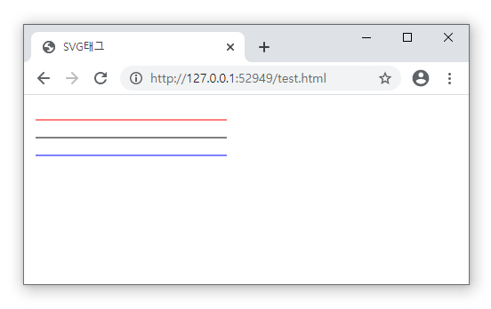
</html>- 여기서 g태그는 그룹을 의미하는 태그입니다.
- M은 이동경로로 시작점을 의미하고 l은 선의 끝 좌표를 의미합니다.
- stroke속성을 선색을 설정합니다.
- 첫번째 선색은 빨간색, 두번째 선색은 검정색, 세번째 색상을 파란색으로 나옵니다.
## 결과
2) stroke-width속성
- stroke-width속성은 선의 굵기를 지정하는 속성입니다.
## 코드
<!DOCTYPE html>
<html lang="ko">
    <head>
        <meta charset="UTF-8">
        <title>SVG태그</title>
        <style>

        </style>
    </head>
    <body>
        <svg width="300" height="80" >
            <g fill="none" stroke="black">
                <path stroke-width="2" d="M5 20 l215 0" />
                <path stroke-width="4" d="M5 40 l215 0" />
                <path stroke-width="6" d="M5 60 l215 0" />
            </g>
        </svg>
    </body>
</html>
- 여기서 g태그는 그룹을 의미하는 태그입니다.
- M은 이동경로로 시작점을 의미하고 l은 선의 끝 좌표를 의미합니다.
- stroke속성을 선색을 설정합니다. 그룹(g)에 주면 모든 패스에 한번에 적용됩니다.
- stroke-width속성은 선굵기를 설정합니다.
## 결과

3) stroke-linecap 속성
- stroke-linecap속성은 선의 가장자리를 처리하는 속성입니다.
- butt값은 선끝으로 딱 자릅니다.
- round값은 선끝을 둥글게 처리합니다.
- square값은 선끝을 네모로 한번더 묶음 처리합니다.
## 코드
<!DOCTYPE html>
<html lang="ko">
    <head>
        <meta charset="UTF-8">
        <title>SVG태그</title>
        <style>

        </style>
    </head>
    <body>
        <svg width="300" height="120" >
            <g fill="none" stroke="black" stroke-width="20">
                <path stroke-linecap="butt" d="M5 20 l215 0" />
                <path stroke-linecap="round" d="M5 60 l215 0" />
                <path stroke-linecap="square" d="M5 100 l215 0" />
            </g>
        </svg>
    </body>
</html>
- 첫번째 선은 딱 끊겨서 처리, 두번째 선은 둥글게 처리, 마지막은 사각형으로 한번 더 감싼 것을 확인할 수 있습니다.
## 결과

4) stroke-dasharray 속성
- stroke-dasharray속성은 점선을 표시하는 속성입니다.
- 홀수번째 적은 숫자는 선의 길이, 짝수번째 적은 숫자는 공백의 길이를 의미합니다.
## 코드
<!DOCTYPE html>
<html lang="ko">
    <head>
        <meta charset="UTF-8">
        <title>SVG태그</title>
        <style>

        </style>
    </head>
    <body>
        <svg width="300" height="80" >
            <g fill="none" stroke="black" stroke-width="4">
                <path stroke-dasharray="5,5" d="M5 20 l215 0" />
                <path stroke-dasharray="10,10" d="M5 40 l215 0" />
                <path stroke-dasharray="20,10,5,5,5,10" d="M5 60 l215 0" />
            </g>
        </svg>
    </body>
</html>
## 결과

5) stroke-dashoffset 속성
- stroke-dashoffset은 점선을 어디서 부터 보여줄지 지정하는 속성입니다.
## 코드
<!DOCTYPE html>
<html lang="ko">
    <head>
        <meta charset="UTF-8">
        <title>SVG태그</title>
        <style>

        </style>
    </head>
    <body>
        <svg width="300" height="80" >
            <g fill="none" stroke="black" stroke-width="4" stroke-dasharray="20,10">
                <path d="M5 20 l215 0" stroke-dashoffset="0" />
                <path d="M5 40 l215 0" stroke-dashoffset="10" />
                <path d="M5 60 l215 0" stroke-dashoffset="20" />
            </g>
        </svg>
    </body>
</html>
- 수치가 양수이면 왼쪽으로 이동, 수치가 음수이면 오른쪽으로 이동됩니다.
## 결과

3. dash를 이용한 원형 프로그레스바 만들기
## 코드
<!DOCTYPE html>
<html lang="ko">
<head>
<meta charset="UTF-8">
<title>원형 Progress Bar</title>
<style>
*{ padding: 0; margin: 0; }
.box{
position: relative; /* 자손앱솔루트 기준을 현재요소로 변경*/
float: left;
width: 200px; height: 200px; margin: 25px;
border: 20px solid #f0f0f0;
box-sizing: border-box; border-radius: 100px; /* 원만들기 */
}
.box > span{
position: absolute; top: 0; left: 0;
display: block; width: 100%; height: 100%;
text-align: center; line-height: 160px;
font-size: 50px; font-weight: bold;
}
.box > .text01{ color: pink; }
.box > .text02{ color: coral; }
.box > .text03{ color: lightblue; }
.box > .text04{ color: aquamarine; }
.box svg{
position: absolute; left: -20px; top: -20px;
width: 200px; height: 200px;
}
.box circle{
fill: transparent;
stroke: #333; stroke-width: 20px;
/* 테두리 점선 */
/*stroke-dasharray: 10px; - 점선도 10px 간격도 10px */
stroke-dasharray: 565px; /* 200px일때의 점선 길이 */
transform: rotate(-90deg); /* 시작상단으로 돌리기 위해 사용 */
transform-origin: center center; /* 반드시 작성 */
}
/* 각각 색 처리와 선 위치 밀기 */
.box > .text01 + svg circle{ stroke: pink; stroke-dashoffset: 395px !important; }
.box > .text02 + svg circle{ stroke: coral; stroke-dashoffset: 282.5px !important; }
.box > .text03 + svg circle{ stroke: lightblue; stroke-dashoffset: 141px !important; }
.box > .text04 + svg circle{ stroke: aquamarine; stroke-dashoffset: 0px !important; }
</style>
</head>
<body>
<div class="box">
<span class="text01">30%</span>
<svg>
<circle cx="100" cy="100" r="90" />
</svg>
</div>
<div class="box">
<span class="text02">50%</span>
<svg>
<circle cx="100" cy="100" r="90" />
</svg>
</div>
<div class="box">
<span class="text03">75%</span>
<svg>
<circle cx="100" cy="100" r="90" />
</svg>
</div>
<div class="box">
<span class="text04">100%</span>
<svg>
<circle cx="100" cy="100" r="90" />
</svg>
</div>
</body>
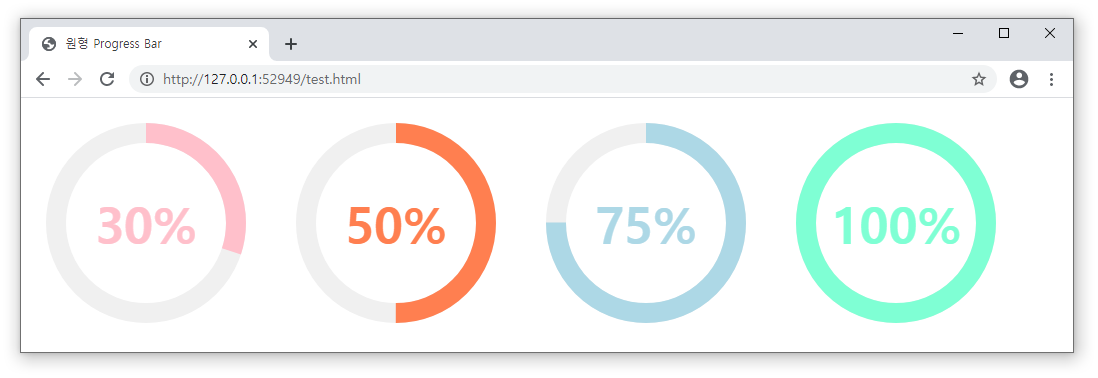
</html>- 선길이의 위치를 어떻게 처리하냐에 따라 %정도로 가능합니다.
- 원영역에 200px일때 스트로크 전체 길이는 565px정도 됩니다.
- 그래서 dashoffset이 0이면 선색이 전부 보이는 100%가 됩니다.
- 565px의 반인 282.5px이 되면 50%가 되는 것입니다.
## 결과
'웹언어 > HTML5' 카테고리의 다른 글
| [HTML기초문법] 17강 meta태그와 viewport - 오쌤의 니가스터디 (2) | 2020.10.26 |
|---|---|
| [HTML기초문법] 16강 SVG태그의 effect와 gradient - 오쌤의 니가스터디 (0) | 2020.10.23 |
| [HTML기초문법] 14강 SVG태그 Path와 TEXT활용 - 오쌤의 니가스터디 (0) | 2020.10.19 |
| [HTML기초문법] 13강 SVG태그 및 이미지 활용 - OSSAM강좌 (2) | 2020.08.30 |
| [HTML기초문법] 12강 시멘틱구조태그 - OSSAM강좌 (0) | 2020.08.27 |


